


Incheon Airport+
Incheon Airport Smart Guide Mobile App
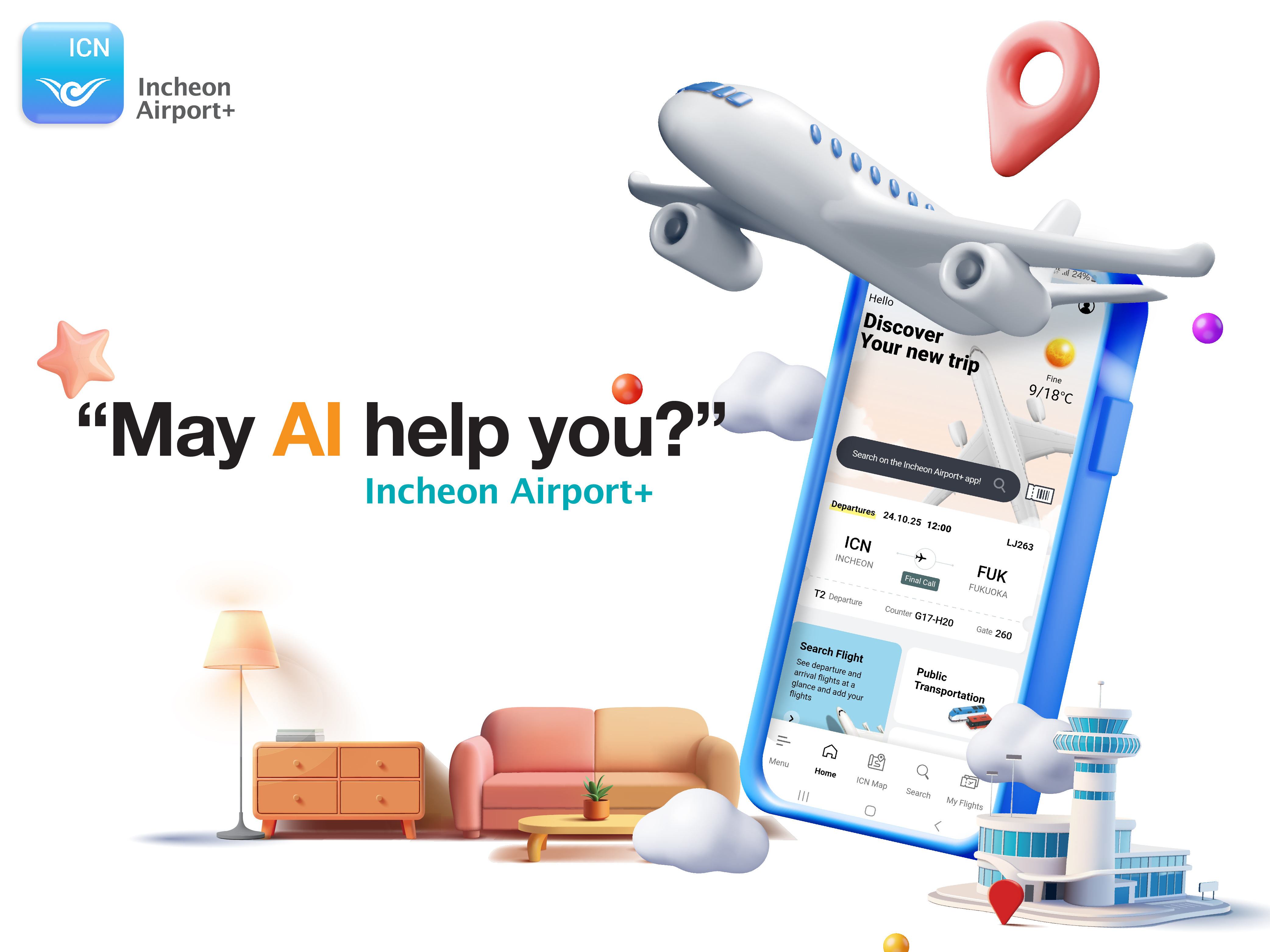
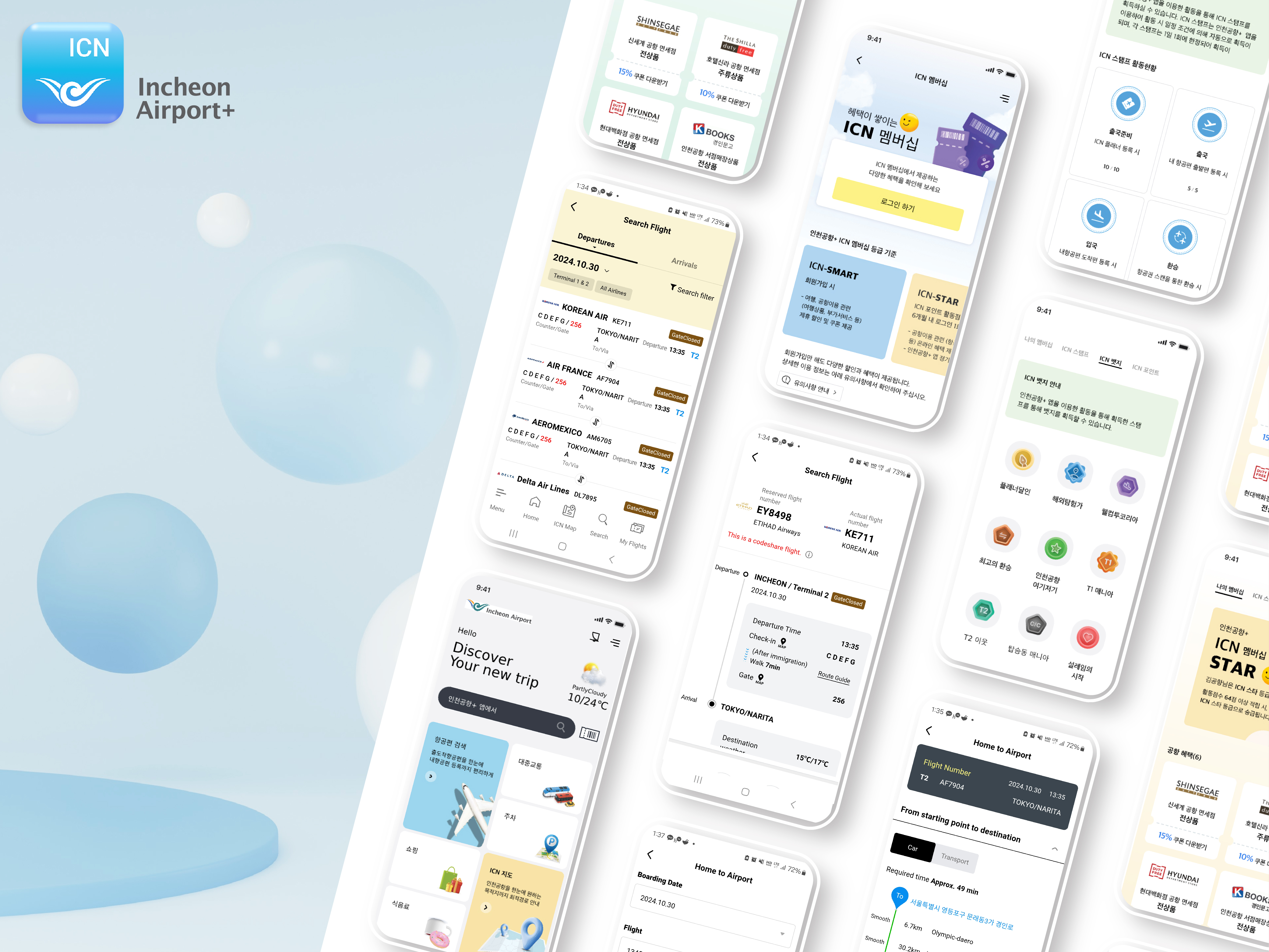
Three Design Strategies: Color, Material, Grid Intuitive and organized card-style layout Providing an easy and simple customer experience The nine main colors, based on calm blue and soft yellow, are applied to key functions that users need to focus on. Nine shades of gray and three soft pastel background colors enhance the visibility of the brand colors. With 21 facility guide icons and 9 weather icons, anyone can understand important information and use the app regardless of language.
Client / Manufacturer Design
Incheon International Airport Corporation
Incheon, KRDKI Technology
5F, DONGHWA BLDG. 71, Yeouinaru-ro, Yeongdeungpo-gu, Seoul 07327 Korea, KRPlanning & Design OfficeDate of Launch
2024
Development Time
more than 24 Month
Target Regions
Africa, Asia, Australia / Oceania, Europe, North America, South America
Target Groups
Consumers / Users, Trade / Industry, Public Sector / Government